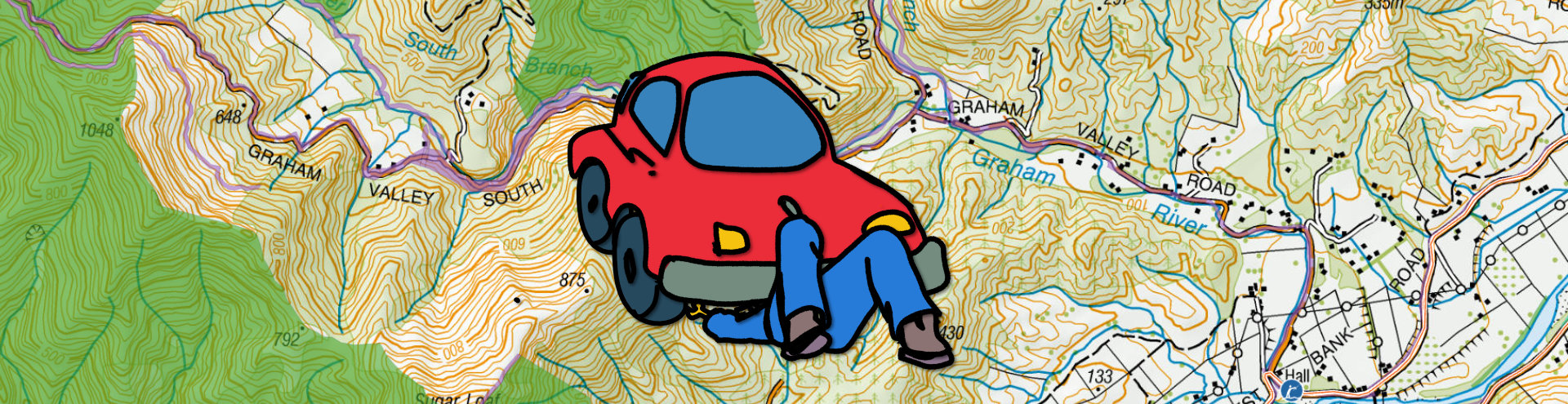
A peek under the hood of the powerful new engine driving our maps
The engine that drives Aotearoa’s best mapping of public access is getting an overhaul, and with it, some extra oomph.
That “engine” is the Data Improvement Programme run by the Geographic Information Systems (GIS) and Operations teams at Herenga ā Nuku Aotearoa, the Outdoor Access Commission.
The engine’s “ignition key” is the Walking Access Act 2008, which established the Commission, and states it shall publish maps of public access areas.
“The Public Access Area (PAA) data set is our taonga, our value-add for the people of Aotearoa,” says the Commission’s GIS Manager Matt Grose.
He says looking after that taonga (treasure) is the Data Improvement Programme's point.
“It’s an overhaul of the engine we use to create Public Access Areas.”
So far in this overhaul, the bodywork has changed little, but “an awful lot of complexity” has been added under the hood, he says.
Stick-shift to automatic
The Commission’s data on Public Access Areas was derived initially using a script developed around 2016.
It queried text attributes within the cadastral data to identify public access areas.
Due to some inconsistencies, that script was disconnected around 2018. Since then, PAA have been manually updated as and when errors are found.
Matt says the way the public access data was set up was a good start, but it was missing a lot.
From early 2023, the team began focusing on quality as a metric and on how they could improve it, which gave rise to the Data Improvement Programme.
The team needed an automated, repeatable process. Instead of a script, they created a pipeline.
“One of the main facets of the programme we’ve been burrowing into is the data pipeline – this architecture. The model requires each public access area to be represented as parcel-based data, because that fits with the cadastre and all the relevant attribution aligning with parcels.”
It also needed to capture the value of the local knowledge of the Commission’s Regional Field Advisors, who often spot anomalies that its national GIS and Operations teams otherwise wouldn’t see.
“They find areas that, you know, why isn’t this area public access in the data set? Because it is public access, and maybe there’s some hidden piece of evidence deep down… and when they find that little treasure and confirm it, we want to capture that moment and repeat it in the data set.”
Treasure hunt: Regional Field Advisors have the local knowledge to ensure all public access areas are captured in Herenga ā Nuku's mapping system.
The aim is also to create as much extra value as possible for people looking for public access information.
Specifically, on who manages the land. Matt says that when people investigate crossing a piece of land, they often get the message: “Please contact the land manager before accessing.” But it can be hard to find exactly who that is.
“So, OK, let’s try and put that up front. Where possible, we point people toward the land manager, in the cases of, for example, DOC and local authorities.”
While doing this, the team also takes the opportunity to improve the re-coding of area names, because the names aren’t necessarily held in the cadastre data.
Flashing dash lights
The other big improvement issue the programme is tackling comes under the heading “exceptions”. There are several flashing engine warning lights, Matt Grose says, but they’re necessary and even helpful.
“It has been a bit of a tune-up… every time you look under the hood, you find other problems. Do we need to look at all these problems? It’s kind of self-driving. When you’ve started down this road, and you’re rebuilding the engine at the same time, you can’t ignore stuff just because it’s complicated… so while we’ve been on the journey, we’re trying to replace sparkplugs and belts.”
So, what are these flashing warning lights?
The original script queries what “statutory actions” resulted in text terms indicating public access. That is, what actual legislative action resulted in public access for any given parcel. It seeks a definitive “yes” or “no” regarding public access. Where the answer is not definitive, parcels are tagged as “maybe.”
That process is the same for the pipeline, but it extends that text querying beyond statutory actions only, to a hierarchy of text elements: title purpose, statutory purpose and statutory actions in turn.
“This increases the complexity of the text mining, but the aim is to reduce the uncertainty of the output and… reduce the number of maybes, and increase the yeses and noes,” Matt says.
“That hierarchy… is the real oomph of the query.”
Two other core data inputs into the pipeline are Public Conservation Land (PCL) and council parks and reserves.
Rather than being parcel-based, Public Conservation Land is currently provided as conservation units, such as “Tararua Forest Park.”
“And if we’re aiming for a parcel-based result at the end, we have to do the spatial operation to intersect PCL with the parcel fabric and ensure the properties of PCL are converted into those parcels,” Matt says.
More power: Increasing certainty about what access is definitely public and what definitely isn't is the "oomph" of the data engine.
The same thing applies to council data, with the added complication of greater variation in the quality of the supply; this is improving, however.
“About six months ago, three or four councils were providing data … I think we’re now up to about 27.”
Also, the way councils manage their data varies.
“If you ask where their reserves are, some have a data set, some have an asset database… and they don’t necessarily publish which ones are accessible to the public.”
The team hopes both issues will improve as more councils get involved. In the meantime, the data they are using is a “vast improvement” on what it was.
Like PCL, though, council data is not parcel-based, so it, too, needs to be translated into the parcel fabric.
Gnarly gear-changes
Other data that feeds into the pipeline includes marginal strips and roads.
Marginal strips are complicated, Matt says, and there’s a debate about how best to deal with this complexity.
To improve the processing of roading data, the team is investigating ways to identify and differentiate formed versus unformed legal roads.
A further input comes from sources such as the Central Record of State Land (CROSL), which identify who manages each piece of land, Matt says.
“Again, in a hierarchical way, because it’s not always straightforward and CROSL doesn’t cover everything, and there are some gaps, and we can fill them in from other sources.”
CROSL and council databases do record common names, but not always the same ones.
“So, which one is better? These are the sort of decisions we need to make.”
Despite such complications, the team focuses on the data set’s core value: whether the public can access a given piece of land.
The final element of the pipeline is the above-mentioned exceptions, Matt says.
“The pipeline is all about rules, and when something doesn’t follow the rules, or there’s evidence outside of what we’re looking at, it becomes an exception, and we want to capture that… Over time, exceptions are the value-add of Herenga ā Nuku … managing and incorporating changes is much gnarlier than we anticipated when we went into it. And that’s why exceptions are quite important.”
Panel and paint
Matt says a final element of overhauling the Public Access Areas engine is perhaps more akin to bodywork: symbology, or the way maps display data.
He says that while overhauling a data engine isn’t very visible to the public, that will soon change.
“There will be a point at which we get to see something… because ultimately, this thing needs to get symbolised.”
Clean lines: One possible look for the forthcoming update of the Herenga ā Nuku mapping system.
Senior GIS analyst Julian Hitchman is leading the symbology overhaul.
He says the current version of the PAA has 12 different layers, but this will be simplified to six layers or “classes” of public access area: roads, easements, reserve land, public access conservation land, other parks and reserves, and other public access areas.
Underneath that structure sits another grouping, called “types” of PAA. There are now 37 of these, such as recreation reserve, esplanade reserve, amenity area, Māori reservation and scientific reserve.
“We’ve changed the architecture quite significantly, so we have much more detail,” Julian says.
“So any time you click on something, you’re able to see its class, type, and public access value.”
The team is exploring various symbology options and ideas for the new PAA.
“And the key driver is to make it discernible across different backgrounds,” Julian says.
“As the project moves from a technical, scripting phase into a… production phase, we’re starting to think about how it will look on the front end, what it will be like to interact with.
“In terms of visual hierarchy, design principles and legibility, reducing complexity is also very valuable.”
Being open to change was key, he says, but not change for change’s sake.
“We don’t want to ‘tutū’ for no reason. We want to make good decisions based on clear rationale.”
Concluding, Matt Grose says the Data Improvement Project is endlessly complex, but also endlessly rewarding – like looking into an intricate engine.
“The more you look, the more you see.”